
条形图
在R语言中创建条形图的基本语法是
barplot(H, xlab, ylab, main, names.arg, col)
H是包含在条形图中使用的数值的向量或矩阵
xlab是x轴的标签
ylab是y轴的标签
main是条形图的标题
names.arg是在每个条下出现的名称的向量
col用于向图中的条形提供颜色
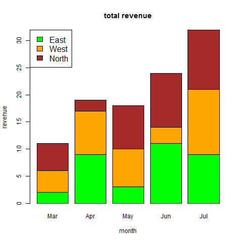
组合条形图和堆积条形图
# Create the input vectors.
colors <- c("green","orange","brown")
months <- c("Mar","Apr","May","Jun","Jul")
regions <- c("East","West","North")
# Create the matrix of the values.
Values <- matrix(c(2,9,3,11,9,4,8,7,3,12,5,2,8,10,11),nrow = 3,ncol = 5,byrow = TRUE)
# Give the chart file a name.
png(file = "barchart_stacked.png")
# Create the bar chart.
barplot(Values,main = "total revenue",names.arg = months,xlab = "month",ylab = "revenue",col = colors)
# Add the legend to the chart.
legend("topleft", regions, cex = 1.3, fill = colors)
# Save the file.
dev.off()
箱线图表示数据集中的最小值,最大值,中值,第一四分位数和第三四分位数
在R语言中创建箱线图的基本语法是
boxplot(x, data, notch, varwidth, names, main)
x是向量或公式
data是数据帧
notch是逻辑值。设置为TRUE以绘制凹口
varwidth是一个逻辑值。设置为true以绘制与样本大小成比例的框的宽度
names是将打印在每个箱线图下的组标签
main用于给图表标题
带槽的箱线图
# Give the chart file a name.
png(file = "boxplot_with_notch.png")
# Plot the chart.
boxplot(mpg ~ cyl, data = mtcars,
xlab = "Number of Cylinders",
ylab = "Miles Per Gallon",
main = "Mileage Data",
notch = TRUE,
varwidth = TRUE,
col = c("green","yellow","purple"),
names = c("High","Medium","Low")
)
# Save the file.
dev.off()
直方图表示被存储到范围中的变量的值的频率。 直方图类似于条形图,但不同之处在于将值分组为连续范围。直方图中的每个柱表示该范围中存在的值的数量的高度
使用R语言创建直方图的基本语法是
hist(v,main,xlab,xlim,ylim,breaks,col,border)
v是包含直方图中使用的数值的向量
main表示图表的标题
col用于设置条的颜色
border用于设置每个条的边框颜色
xlab用于给出x轴的描述
xlim用于指定x轴上的值的范围
ylim用于指定y轴上的值的范围
break用于提及每个条的宽度
在R语言中创建折线图的基本语法是
plot(v,type,col,xlab,ylab)
v是包含数值的向量
类型采用值“p”仅绘制点,“l”仅绘制线和“o”绘制点和线
xlab是x轴的标签
ylab是y轴的标签
main是图表的标题
col用于给点和线的颜色
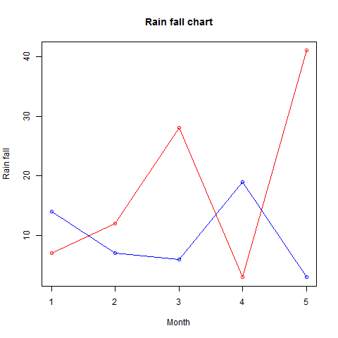
多线型折线图
通过使用lines()函数,可以在同一个图表上绘制多条线
# Create the data for the chart.
v <- c(7,12,28,3,41)
t <- c(14,7,6,19,3)
# Give the chart file a name.
png(file = "line_chart_2_lines.jpg")
# Plot the bar chart.
plot(v,type = "o",col = "red", xlab = "Month", ylab = "Rain fall", main = "Rain fall chart")
lines(t, type = "o", col = "blue")
# Save the file.
dev.off()
在R语言中创建散点图的基本语法是
plot(x, y, main, xlab, ylab, xlim, ylim, axes)
x是其值为水平坐标的数据集
y是其值是垂直坐标的数据集
main要是图形的图块
xlab是水平轴上的标签
ylab是垂直轴上的标签
xlim是用于绘图的x的值的极限
ylim是用于绘图的y的值的极限
axes指示是否应在绘图上绘制两个轴
在R中创建散点图矩阵的基本语法是
pairs(formula, data)
formula表示成对使用的一系列变量
data表示将从其获取变量的数据集
使用R语言创建饼图的基本语法是
pie(x, labels, radius, main, col, clockwise)
x是包含饼图中使用的数值的向量
labels用于给出切片的描述
radius表示饼图圆的半径(值-1和+1之间)
main表示图表的标题
col表示调色板
clockwise是指示片段是顺时针还是逆时针绘制的逻辑值
内容来源于网络如有侵权请私信删除
- 还没有人评论,欢迎说说您的想法!


 客服
客服


