
animation关键帧使用介绍:
<!DOCTYPE html>
<html lang="en">
<head>
    <meta charset="UTF-8">
    <title>Document</title>
    <meta name="viewport" content="width=device-width,minimum-scale=1.0,maximum-scale=1.0,user-scalable=no">
    <link rel="stylesheet" href="https://maxcdn.bootstrapcdn.com/font-awesome/4.7.0/css/font-awesome.min.css">
    <script src="https://cdn.staticfile.org/jquery/1.10.0/jquery.js"></script>

    <style>
        *{
            margin:0;
            padding:0;
            box-sizing:border-box;
        }
        body{
            width:100vw;
            height:100vh;
            display:flex;
            justify-content: center;
            align-items: center;
            background-color: #34495e;
        }
        main{
            width:100px;
            height:100px;
            background:white;
            animation-name:hd;
            animation-duration:2s;
        }
        /* @keyframes hd{
            from{
                background:white;
            }
            to{
                background:#e91e63;
            }
        } */
        @keyframes hd{
            0%{
                background:white;
            }
            25%{
                transform:scale(2);
            }
            65%{
                transform:scale(1);
            }
            100%{
                background:#e91e63;
            }
        }
    </style>
</head>
<body>
    <main></main>
</body>
</html>
帧顺序与起始与终点帧特性:
顺序颠倒不影响;
起点帧不写的话,是使用元素默认的状态;
终点帧不设置的话,也是会回到元素默认的状态;
<!DOCTYPE html>
<html lang="en">
<head>
    <meta charset="UTF-8">
    <title>Document</title>
    <meta name="viewport" content="width=device-width,minimum-scale=1.0,maximum-scale=1.0,user-scalable=no">
    <link rel="stylesheet" href="https://maxcdn.bootstrapcdn.com/font-awesome/4.7.0/css/font-awesome.min.css">
    <script src="https://cdn.staticfile.org/jquery/1.10.0/jquery.js"></script>

    <style>
        *{
            margin:0;
            padding:0;
            box-sizing:border-box;
        }
        body{
            width:100vw;
            height:100vh;
            display:flex;
            justify-content: center;
            align-items: center;
            background-color: #34495e;
        }
        main{
            width:100px;
            height:100px;
            background:white;
            animation-name:hd;
            animation-duration:2s;
        }
        @keyframes hd{
            100%{
                background:#e91e63;
            }
            0%{
                background:white;
            }

        }
    </style>
</head>
<body>
    <main></main>
</body>
</html>
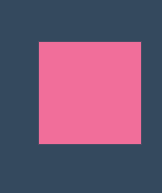
移动的小方块:
<!DOCTYPE html>
<html lang="en">
<head>
    <meta charset="UTF-8">
    <title>Document</title>
    <meta name="viewport" content="width=device-width,minimum-scale=1.0,maximum-scale=1.0,user-scalable=no">
    <link rel="stylesheet" href="https://maxcdn.bootstrapcdn.com/font-awesome/4.7.0/css/font-awesome.min.css">
    <script src="https://cdn.staticfile.org/jquery/1.10.0/jquery.js"></script>

    <style>
        *{
            margin:0;
            padding:0;
            box-sizing:border-box;
        }
        body{
            width:100vw;
            height:100vh;
            display:flex;
            justify-content: center;
            align-items: center;
            background-color: #34495e;
        }
        main{
            width:400px;
            height:400px;
            border:1px solid #ddd;
        }
        div{
            width:100px;
            height:100px;
            background:pink;
            animation-name:hd;
            animation-duration:4s;
        }
        @keyframes hd{
            25%{
                transform:translate(300px,0);
            }
            50%{
                transform:translate(300px,300px);
            }
            75%{
                transform:translate(0,300px);
            }
        }
    </style>
</head>
<body>
    <main>
        <div></div>
    </main>
</body>
</html>

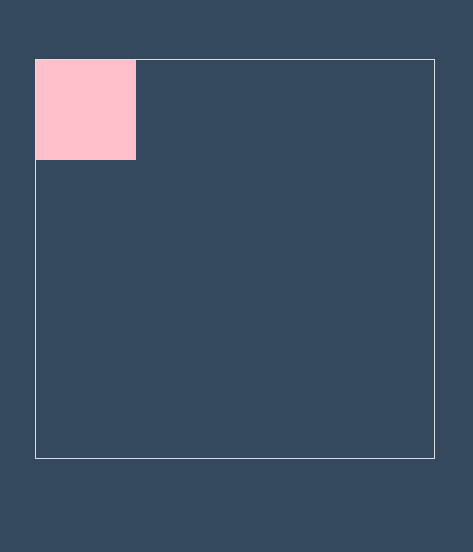
同时声明关键帧规则:
<!DOCTYPE html>
<html lang="en">
<head>
    <meta charset="UTF-8">
    <title>Document</title>
    <meta name="viewport" content="width=device-width,minimum-scale=1.0,maximum-scale=1.0,user-scalable=no">
    <link rel="stylesheet" href="https://maxcdn.bootstrapcdn.com/font-awesome/4.7.0/css/font-awesome.min.css">
    <script src="https://cdn.staticfile.org/jquery/1.10.0/jquery.js"></script>

    <style>
        *{
            margin:0;
            padding:0;
            box-sizing:border-box;
        }
        body{
            width:100vw;
            height:100vh;
            display:flex;
            justify-content: center;
            align-items: center;
            background-color: #34495e;
        }
        main{
            width:400px;
            height:400px;
            border:1px solid #ddd;
        }
        div{
            width:100px;
            height:100px;
            background:pink;
            animation-name:hd;
            animation-duration:4s;
        }
        @keyframes hd{
            25%{
                transform:translate(300px,0);
            }
            50%{
                transform:translate(300px,300px);
                background:pink;
                border-radius:0;
            }
            75%{
                transform:translate(0,300px);
            }
            25%,75%{
                background:#abcdef;
                border-radius:50%;
            }
        }
    </style>
</head>
<body>
    <main>
        <div></div>
    </main>
</body>
</html>

多个动画使用与时间配置:
当动画数量超过定义的动画时间数量时,多出的动画会从头循环时间
<!DOCTYPE html>
<html lang="en">
<head>
    <meta charset="UTF-8">
    <title>Document</title>
    <meta name="viewport" content="width=device-width,minimum-scale=1.0,maximum-scale=1.0,user-scalable=no">
    <link rel="stylesheet" href="https://maxcdn.bootstrapcdn.com/font-awesome/4.7.0/css/font-awesome.min.css">
    <script src="https://cdn.staticfile.org/jquery/1.10.0/jquery.js"></script>

    <style>
        *{
            margin:0;
            padding:0;
            box-sizing:border-box;
        }
        body{
            width:100vw;
            height:100vh;
            display:flex;
            justify-content: center;
            align-items: center;
            background-color: #34495e;
        }
        main{
            width:400px;
            height:400px;
            border:1px solid #ddd;
        }
        div{
            width:100px;
            height:100px;
            background:pink;
            animation-name:translate,background;
            animation-duration:4s;
            animation-duration:4s,2s;
        }
        @keyframes translate{
            25%{
                transform:translate(300px,0);
            }
            50%{
                transform:translate(300px,300px);
            }
            75%{
                transform:translate(0,300px);
            }
        }
        @keyframes background{
            25%{
                background:#c9e91e;
            }
            50%{
                background:#ffc107;
            }
            75%{
                background:#2196f3;
            }
        }
    </style>
</head>
<body>
    <main>
        <div></div>
    </main>
</body>
</html>
属性重叠对动画的影响:
当属性重叠时,前面的会被后面的覆盖
<!DOCTYPE html>
<html lang="en">
<head>
    <meta charset="UTF-8">
    <title>Document</title>
    <meta name="viewport" content="width=device-width,minimum-scale=1.0,maximum-scale=1.0,user-scalable=no">
    <link rel="stylesheet" href="https://maxcdn.bootstrapcdn.com/font-awesome/4.7.0/css/font-awesome.min.css">
    <script src="https://cdn.staticfile.org/jquery/1.10.0/jquery.js"></script>

    <style>
        *{
            margin:0;
            padding:0;
            box-sizing:border-box;
        }
        body{
            width:100vw;
            height:100vh;
            display:flex;
            justify-content: center;
            align-items: center;
            background-color: #34495e;
        }
        main{
            width:400px;
            height:400px;
            border:1px solid #ddd;
        }
        div{
            width:100px;
            height:100px;
            background:pink;
            animation-name:translate,background;
            animation-duration:4s;
            animation-duration:4s,2s;
        }
        @keyframes translate{
            25%{
                transform:translate(300px,0);
            }
            50%{
                transform:translate(300px,300px);
            }
            75%{
                transform:translate(0,300px);
            }
        }
        @keyframes background{
            25%{
                background:#c9e91e;
                transform:translate(300px,0);
            }
            50%{
                background:#ffc107;
            }
            75%{
                background:#2196f3;
            }
        }
    </style>
</head>
<body>
    <main>
        <div></div>
    </main>
</body>
</html>

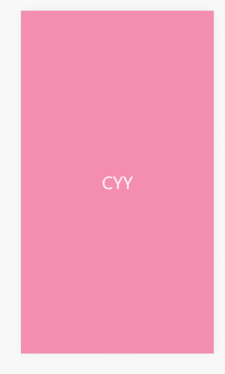
多动画控制移动端引导背景页:
<!DOCTYPE html>
<html lang="en">
<head>
    <meta charset="UTF-8">
    <title>Document</title>
    <meta name="viewport" content="width=device-width,minimum-scale=1.0,maximum-scale=1.0,user-scalable=no">
    <link rel="stylesheet" href="https://maxcdn.bootstrapcdn.com/font-awesome/4.7.0/css/font-awesome.min.css">
    <script src="https://cdn.staticfile.org/jquery/1.10.0/jquery.js"></script>

    <style>
        *{
            margin:0;
            padding:0;
            box-sizing:border-box;
        }
        body{
            background-color: dimgrey;
        }
        main{
            width:100vw;
            height:100vh;
            background-color: #34495e;
            transform:scale(0);
            animation-name:scale,background;
            animation-duration:2s;
            animation-fill-mode:forwards;
            display:flex;
            justify-content: center;
            align-items: center;
        }
        main::after{
            content:'CYY';
            color:white;
            font-size:2em;
            opacity:0;
            animation-name:opacity;
            animation-duration:1s;
            animation-delay:2s;
            animation-fill-mode:forwards;
        }
        @keyframes opacity{
            to{
                opacity:.8;
            }
        }
        @keyframes scale{
            25%{
                transform:scale(.5);
            }
            50%{
                transform:scale(1) rotate(360deg);
            }
            75%{
                transform:scale(.5);
            }
            100%{
                transform:scale(1);
            }
        }
        @keyframes background{
            25%{
                background:#c9e91e;
            }
            50%{
                background:#ffc107;
            }
            75%{
                background:#2196f3;
            }
            100%{
                background:#f48eb1;
            }
        }
    </style>
</head>
<body>
    <main>

    </main>
</body>
</html>
动画属性中间值详解:
有中间值的属性才可以进行动画,否则就是突变
animation-iteration-count 控制动画播放次数
<!DOCTYPE html>
<html lang="en">
<head>
    <meta charset="UTF-8">
    <title>Document</title>
    <meta name="viewport" content="width=device-width,minimum-scale=1.0,maximum-scale=1.0,user-scalable=no">
    <link rel="stylesheet" href="https://maxcdn.bootstrapcdn.com/font-awesome/4.7.0/css/font-awesome.min.css">
    <script src="https://cdn.staticfile.org/jquery/1.10.0/jquery.js"></script>

    <style>
        *{
            margin:0;
            padding:0;
            box-sizing:border-box;
        }
        body{
            width:100vw;
            height:100vh;
            display:flex;
            justify-content: center;
            align-items: center;
            background-color: #34495e;
        }
        main{
            width:400px;
            height:400px;
            border:1px solid #ddd;
        }
        div{
            width:100px;
            height:100px;
            background:pink;
            animation-name:translate,background;
            animation-duration:2s;
            animation-iteration-count:2;
            animation-iteration-count:2,1;
            /* 无限循环 */
            animation-iteration-count:infinite;
        }
        @keyframes translate{
            25%{
                transform:translate(300px,0);
            }
            50%{
                transform:translate(300px,300px);
            }
            75%{
                transform:translate(0,300px);
            }
        }
        @keyframes background{
            25%{
                background:#c9e91e;
            }
            50%{
                background:#ffc107;
            }
            75%{
                background:#2196f3;
            }
        }
    </style>
</head>
<body>
    <main>
        <div></div>
    </main>
</body>
</html>

使用变形绘制小心心:
<!DOCTYPE html>
<html lang="en">
<head>
    <meta charset="UTF-8">
    <title>Document</title>
    <meta name="viewport" content="width=device-width,minimum-scale=1.0,maximum-scale=1.0,user-scalable=no">
    <link rel="stylesheet" href="https://maxcdn.bootstrapcdn.com/font-awesome/4.7.0/css/font-awesome.min.css">
    <script src="https://cdn.staticfile.org/jquery/1.10.0/jquery.js"></script>

    <style>
        *{
            margin:0;
            padding:0;
            box-sizing:border-box;
        }
        body{
            width:100vw;
            height:100vh;
            display:flex;
            justify-content: center;
            align-items: center;
            background-color: #34495e;
        }
        .heart{
            width:200px;
            height:200px;
            background:#e93e1e;
            position:relative;
            transform:rotate(45deg) scale(.5);
            animation-name:hd;
            animation-duration:2s;
            animation-iteration-count:infinite;
            opacity:.5;

        }
        @keyframes hd{
            20%{
                transform:rotate(45deg) scale(1);
                opacity:1;
            }
            40%{
                transform:rotate(45deg) scale(.5);
                opacity:.5;
            }
            60%{
                transform:rotate(45deg) scale(1);
                opacity:1;
            }
            80%{
                transform:rotate(45deg) scale(.5);
                opacity:.5;
            }
            100%{
                transform:rotate(45deg) scale(1);
                opacity:1;
            }
        }
        .heart::before{
            content:'';
            width:200px;
            height:200px;
            background:#e93e1e;
            transform:translateX(-100px);
            position:absolute;
            border-radius:50%;
        }
        .heart::after{
            content:'';
            width:200px;
            height:200px;
            background:#e93e1e;
            transform:translateY(-100px);
            position:absolute;
            border-radius:50%;
        }
    </style>
</head>
<body>
    <div class="heart"></div>
</body>
</html>

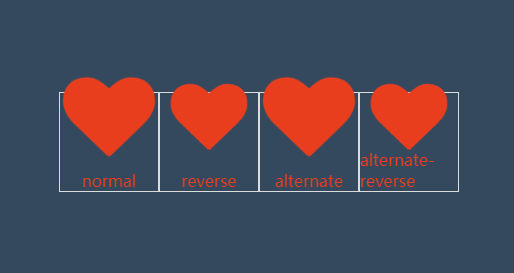
animation-direction 控制动画方向的四种模式:
<!DOCTYPE html>
<html lang="en">
<head>
    <meta charset="UTF-8">
    <title>Document</title>
    <meta name="viewport" content="width=device-width,minimum-scale=1.0,maximum-scale=1.0,user-scalable=no">
    <link rel="stylesheet" href="https://maxcdn.bootstrapcdn.com/font-awesome/4.7.0/css/font-awesome.min.css">
    <script src="https://cdn.staticfile.org/jquery/1.10.0/jquery.js"></script>

    <style>
        *{
            margin:0;
            padding:0;
            box-sizing:border-box;
        }
        body{
            width:100vw;
            height:100vh;
            display:flex;
            justify-content: center;
            align-items: center;
            background-color: #34495e;
        }
        ul{
            width:400px;
            height:100px;
            list-style:none;
            display:flex;
        }
        li{
            color:#e93e1e;
            flex:1;
            border:1px solid #ddd;
            display:flex;
            justify-content: center;
            position: relative;;
        }
        li span{
            position:absolute;
            bottom:0;
        }
        li:nth-child(1)>i{
            /* 默认值normal,不加也可以 */
            /* 正向,循环时突变 */
            animation-direction:normal;
        }
        li:nth-child(2)>i{
            /* 反向,循环时突变 */
            animation-direction:reverse;
        }
        li:nth-child(3)>i{
            /* 正向,循环时过渡 */
            animation-direction:alternate;
        }
        li:nth-child(4)>i{
            /* 反向,循环时过渡 */
            animation-direction:alternate-reverse;
        }
        i.fa{
            font-size:3em;
            animation-name:scale;
            animation-duration:2s;
            animation-iteration-count:infinite;
            position:absolute;
        }
        @keyframes scale{
            to{
                transform:scale(2);
            }
        }
    </style>
</head>
<body>
    <ul>
        <li><i class="fa fa-heart" aria-hidden="true"></i><span>normal</span></li>
        <li><i class="fa fa-heart" aria-hidden="true"></i><span>reverse</span></li>
        <li><i class="fa fa-heart" aria-hidden="true"></i><span>alternate</span></li>
        <li><i class="fa fa-heart" aria-hidden="true"></i><span>alternate-reverse</span></li>
    </ul>
</body>
</html>
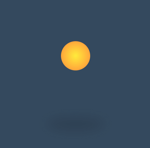
弹跳小球体验动画轮换衔接:
<!DOCTYPE html>
<html lang="en">
<head>
    <meta charset="UTF-8">
    <title>Document</title>
    <meta name="viewport" content="width=device-width,minimum-scale=1.0,maximum-scale=1.0,user-scalable=no">
    <link rel="stylesheet" href="https://maxcdn.bootstrapcdn.com/font-awesome/4.7.0/css/font-awesome.min.css">
    <script src="https://cdn.staticfile.org/jquery/1.10.0/jquery.js"></script>

    <style>
        *{
            margin:0;
            padding:0;
            box-sizing:border-box;
        }
        body{
            width:100vw;
            height:100vh;
            display:flex;
            justify-content: center;
            align-items: center;
            background-color: #34495e;
        }

        div{
            width:100px;
            height:100px;
            background:radial-gradient(at center,#ffeb3b,#ff893b);
            border-radius:50%;

            animation-name:ball;
            animation-duration:.7s;
            animation-iteration-count:infinite;
            animation-direction:alternate-reverse;
        }
        section{
            width:200px;
            height:40px;
            background:rgba(0,0,0,.3);
            border-radius:50%;
            position:absolute;
            transform:translateY(50px);
            z-index:-1;
            filter:blur(5px);

            animation-name:shadow;
            animation-duration:.7s;
            animation-iteration-count:infinite;
            animation-direction:alternate-reverse;
        }
        @keyframes shadow{
            to{
                height:20px;
                background:rgba(0,0,0,.1);
                filter:blur(35px);
            }
        }
        @keyframes ball{
            to{
                transform:translateY(-300px);
            }
        }
    </style>
</head>
<body>
    <div></div>
    <section></section>
</body>
</html>
内容来源于网络如有侵权请私信删除
文章来源: 博客园
- 还没有人评论,欢迎说说您的想法!


 客服
客服


