
借鉴网友博客, 改用后整理收录
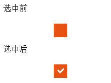
效果图:
移入:

<!DOCTYPE html>
<html>
    <head>
        <meta charset="UTF-8">
        <title></title>
        <style type="text/css">
            .box_inner1{
                width: 25px;
                margin: 20px 100px;        /*最外层盒子的外边距, 可自己调*/
                position: relative;
            }

            .box_inner1 label{
                cursor: pointer;
                position: absolute;
                width: 25px;        /*此处width和height是选框显示出来的大小*/
                height: 25px;
                top:0;                /*此处top和left是选框显示出来位置, 可根据需求进行调节*/
                left: 0;
                background: #e75213;        /*此处是复选框背景颜色, 下面是边框颜色, 设置一致是保持统一*/
                border: 1px solid #E75213;
            }

            .box_inner1 label:after{
                opacity: 1;        /*选中后样式的透明度, 1是不透明*/
                content: '';    /*选中后的内容 ,此处为空是指把默认的去掉, 下面自定义*/
                position: absolute;
                width: 9px;
                height: 5px;
                background: transparent;    /*这一块是核心,可以自己调试看效果*/
                top: 6px;
                left: 7px;
                border: 3px solid white;
                border-top: none;
                border-right: none;

                /*选中的样式是用盒子div加背景色, 加旋转实现的, 下面的代码是旋转45度*/
                -webkit-transform: rotate(-45deg);
                -moz-transform: rotate(-45deg);
                /*-o-transform: rotate(-45deg);*/
                -ms-transform: rotate(-45deg);
                transform: rotate(-45deg);

            }

            .box_inner1 label:hover::after{
                opacity: 0.5;        /*鼠标移入移出的透明度*/
            }

            .box_inner1 input[type=checkbox]:checked + label:after{
                opacity: 0;        /*取消选中*/
            }

            /*要有多个选框, 直接复制一份重命名, 避免冲突*/
            /*第二个*/
            .box_inner2{
                width: 25px;
                margin: 20px 100px;
                position: relative;
            }

            .box_inner2 label{
                cursor: pointer;
                position: absolute;
                width: 25px;
                height: 25px;
                top:0;
                left: 0;
                background: #e75213;
                border: 1px solid #E75213;
            }

            .box_inner2 label:after{
                opacity: 1;
                content: '';
                position: absolute;
                width: 9px;
                height: 5px;
                background: transparent;
                top: 6px;
                left: 7px;
                border: 3px solid white;
                border-top: none;
                border-right: none;

                -webkit-transform: rotate(-45deg);
                -moz-transform: rotate(-45deg);
                /*-o-transform: rotate(-45deg);*/
                -ms-transform: rotate(-45deg);
                transform: rotate(-45deg);

            }

            .box_inner2 label:hover::after{
                opacity: 0.5;
            }

            .box_inner2 input[type=checkbox]:checked + label:after{
                opacity: 0;
            }

            input[type=checkbox]{
                visibility: hidden;
            }


        </style>
    </head>
    <body>
        <div class="box_inner1">
            <input type="checkbox" id="box_innerInput1" />
            <label for="box_innerInput1"></label>
        </div>

        <div class="box_inner2">
            <input type="checkbox" id="box_innerInput2" />
            <label for="box_innerInput2"></label>
        </div>
    </body>
</html>
参考:
http://www.360doc.com/content/15/0528/11/1355383_473823407.shtml
https://blog.csdn.net/qq_34182808/article/details/79992465
内容来源于网络如有侵权请私信删除
- 还没有人评论,欢迎说说您的想法!


 客服
客服


