
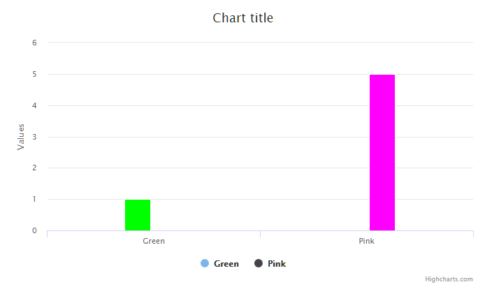
var cate = ['Green', 'Pink'];
Highcharts.chart('container', {
    chart: {
        type: 'column'
    },
    legend: {
        enable: true
    },
    xAxis: {
        type: 'category'
    },
    plotOptions: {
        series: {
            groupPadding: cate.length < 4 ? 0.35 : 0.15
        }
    },
    series: [{
        name: "Green",
        data: [{
            name: 'Green',
            color: '#00FF00',
            y: 1
        }]
    }, {
        name: "Pink",
        data: [{
            name: 'Pink',
            color: '#FF00FF',
            y: 5
        }]
    }]
});
效果图:
内容来源于网络如有侵权请私信删除
- 还没有人评论,欢迎说说您的想法!


 客服
客服


