
1. 实例

2.HTML 代码
<!DOCTYPE html>
<html lang="en">
<head>
    <meta charset="UTF-8">
    <title>CSS3-Fade</title>
    <link rel="stylesheet" type="text/css" href="./fade.css">
</head>
<body>
    <div class="container">
        <div class="fade fade-in">
            fade-in
        </div>
        <div class="fade fade-top">
            fade-top
        </div>
        <div class="fade fade-bottom">
            fade-bottom
        </div>
        <div class="fade fade-left">
            fade-left
        </div>
        <div class="fade fade-right">
            fade-right
        </div>
        <div class="fade bounce-top">
            bounce-top
        </div>
        <div class="fade bounce-bottom">
            bounce-bottom
        </div>
        <div class="fade bounce-left">
            bounce-left
        </div>
        <div class="fade bounce-right">
            bounce-right
        </div>
        <div class="fade fade-center-out">
            fade-center-out
        </div>
        <div class="fade fade-center-in">
            fade-center-in
        </div>
        <div class="fade fade-middle-out">
            fade-middle-out
        </div>
        <div class="fade fade-middle-in">
            fade-middle-in
        </div>
    </div>
</body>
</html>
3.CSS 代码
*{
    padding:0;
    margin:0;
}
html{
    background: -webkit-radial-gradient(#222222, #000000);
    background: radial-gradient(#222222, #000000);
    height: 100%;
    text-align: center;
    width:100%;
}

.container{
    width: 800px;
    margin: 200px auto;
    text-align: left;
}


.fade{
    cursor: pointer;
    box-sizing: border-box;
    display: inline-block;
    color: #09f;
    background: white;
    padding: 10px 20px;
    text-align: center;
    margin: 10px 0;
    /* 设置相对定位 */
    position: relative;
    transition: all 0.3s;
    /* 设置层次 会被before after在上面 */
    z-index:1;
}

.fade:hover{
    color: white;
}

/* 其实使用背景颜色变化就可以的 但是这里为了做统一*/
.fade:before,.fade:after
{
    display: block;
    transition: all 0.3s;
    background: #09f;
    position: absolute;
    content: '';
    z-index: -1;
}

.fade-left:before,.fade-right:before,
.fade-center-out:before,.fade-center-out:after,
.fade-center-in:before,.fade-center-in:after,
.bounce-left:before,.bounce-right:before
{
    height: 100%;
    top:0;
    width:0;
}

.fade-middle-out:before,.fade-middle-out:after,
.fade-middle-in:before,.fade-middle-in:after,
.bounce-bottom:before
{
    height: 0;
    width: 100%;
    left:0;
}

/* 弹跳元素设置时间线 使用三次贝塞尔曲线 */
.bounce-top:before,.bounce-bottom:before,
.bounce-left:before,.bounce-right:before{
    transition-timing-function: cubic-bezier(0.52, 1.7, 0.5, 0.4);
}

.fade-in:before{
    height: 100%;
    width: 100%;
    opacity: 0;
    top:0;
    left: 0;
}

.fade-bottom:before, .fade-top:before,.bounce-top:before{
    height: 0;
    width: 100%;
    left: 0;
}
.fade-top:before,.bounce-top:before,.fade-middle-out:before{
    top:0;
}

.fade-bottom:before,.fade-middle-out:after,.bounce-bottom:before{
    bottom: 0;
}

.fade-left:before,.fade-center-in:before,.bounce-left:before{
    left:0;
}

.fade-right:before,.fade-center-in:after,.bounce-right:before{
    right:0;
}

.fade-center-out:before{
    right: 50%
}
.fade-center-out:after{
    left: 50%
}
.fade-middle-in:before{
    bottom:50%;
}
.fade-middle-in:after{
    top:50%;
}

.fade-in:hover:before{
    opacity: 1;
}

.fade-left:hover:before,.fade-right:hover:before,
.bounce-left:hover:before,.bounce-right:hover:before
{
    width: 100%;
}

.fade-top:hover:before,.fade-bottom:hover:before,
.bounce-top:hover:before,.bounce-bottom:hover:before{
    height: 100%;
}

.fade-center-out:hover:before,.fade-center-out:hover:after,
.fade-center-in:hover:before,.fade-center-in:hover:after{
    width:50%;
}
.fade-middle-out:hover:before,.fade-middle-out:hover:after,
.fade-middle-in:hover:before,.fade-middle-in:hover:after
{
    height:50%;
}
4. 练习
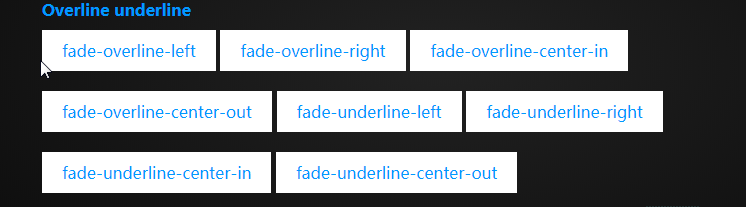
区别只是 heigth属性所设置的高度大小
内容来源于网络如有侵权请私信删除
- 还没有人评论,欢迎说说您的想法!


 客服
客服


