
上章我们学习了2.qml-Window元素使用
所以本章主要讲解Rectangle,下章来学习item基础常用属性.后续再深入讲解QML视觉项上的动画相关机制.
1.Rectangle介绍和Item简单描述
QML的Rectangle元素,用来绘制一个矩形的显示对象。通过设置它的属性来达到我们想要的效果。
- 它自身的属性有: 设置颜色color、渐变gradient、圆角radius、边框border、旋转rotation等。
- 设置radius属性时,默认是打开抗锯齿的,如果有锯齿,可以设置"antialiasing: true"来打开.
- 如果同时设置了color和gradient,那么只有gradient渐变色生效.
Rectangle的父类为Item.如下图所示:
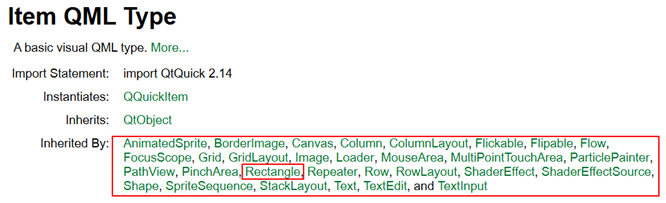
可以看到Item是Qt中所有视觉项元素的基类,并且Item本身是没有视觉外观的。
注意:
- Item只是为了给这些Rectangle、Text等视觉项元素提供通用属性, 如x、y、z位置、width和height大小、anchors锚、输入事件支持等等,所以Item非常重要,在下章详讲
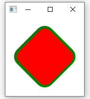
2.Rectangle边框显示示例
import QtQuick 2.12
import QtQuick.Window 2.0

Window{
    visible: true
    Rectangle {
        x: 30
        y: 30
        color: "red"
        width: 100
        height: 100
        border.color: "green" // 设置边框颜色
        border.width: 5       // 设置边框宽度
        radius: 20            // 设置圆角
        antialiasing: true
        rotation: 45          // 按时钟方向旋转45°
    }
}
效果如下所示:
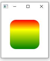
3. Rectangle线性渐变显示示例
在Rectangle中的gradient属性默认是从上往下渐变(垂直渐变)的,然后通过GradientStop来制定每个位置(位置取值0~1.0)上的颜色(color).
代码如下所示:
import QtQuick 2.12
import QtQuick.Window 2.0

Window{
    visible: true
    Rectangle
    {
        x: 30
        y: 30
        color: "red"
        width: 100
        height: 100
        radius: 20            // 设置圆角
        antialiasing: true;
        gradient: Gradient{
            GradientStop { position: 0.0; color: "red" }
            GradientStop { position: 0.33; color: "yellow" }
            GradientStop { position: 1.0; color: "green" }
        }
    }
}
效果如下所示:
如果我们想要实现水平渐变、斜角渐变,则必须使用LinearGradient对象(类似于QLinearGradient).
使用该对象必须声明import QtGraphicalEffects 1.12,然后通过start和end属性来指定渐变的方向.赋值如下所示:
start: Qt.point(int x1, int y1)
end: Qt.point(int x2, int y2)
- 如果x1和x2相等,则表示垂直线性渐变
- 如果y1和y2相等,则表示平行线性渐变
- 如果都不相等,则表示斜角线性渐变
LinearGradient实现水平渐变示例:
import QtQuick 2.12
import QtQuick.Window 2.0
import QtGraphicalEffects 1.12
Window{
    visible: true

    Rectangle
    {
        x: 30
        y: 30
        color: "red"
        width: 100
        height: 100
        antialiasing: true;
        radius: 20            // 设置圆角
        LinearGradient {
            anchors.fill: parent
            start: Qt.point(0, 0)
            end: Qt.point(parent.width, 0)  // y方向相等,所以为水平渐变
            gradient: Gradient {
                GradientStop { position: 0.0; color: "red" }
                GradientStop { position: 0.33; color: "yellow" }
                GradientStop { position: 1.0; color: "green" }

            }
        }
    }
}
效果如下所示:
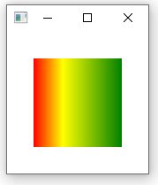
如上图所示,可以看到我们此时的圆角是没有作用的,这是因为"anchors.fill: parent "将会填充整个Rectangle的面积。
如果我们想要实现圆角矩形渐变的话,则需要使用LinearGradient对象的"source"属性,给渐变指定圆角矩形,从而绘制出来的就是个圆角的渐变.
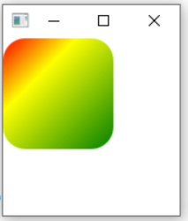
LinearGradient实现圆角的斜角渐变示例
import QtQuick 2.12
import QtQuick.Window 2.0
import QtGraphicalEffects 1.12
Window{
    visible: true

    Item {
        width: 100
        height: 100

        Rectangle {
            id: rect
            anchors.fill: parent
            radius: 20            // 设置圆角
            antialiasing: true
        }

        LinearGradient {
            anchors.fill: rect
            source: rect         // 填充颜色到id为rect的对象上
            start: Qt.point(0, 0)
            end: Qt.point(parent.width, parent.height)
            gradient: Gradient {
                GradientStop { position: 0.0; color: "red" }
                GradientStop { position: 0.33; color: "yellow" }
                GradientStop { position: 1.0; color: "green" }
            }
       }
    }
}
效果如下所示:
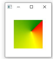
3. ConicalGradient圆锥渐变显示示例
ConicalGradient的常用属性如下所示:
- angle : real,起始的顺时针角度位置
- cached : bool,是否缓存,默认false
- gradient : Gradient,渐变的位置和颜色
- horizontalOffset : real,中心点的水平偏移位置
- verticalOffset : real, 中心点的垂直偏移位置
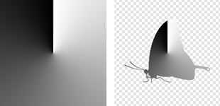
- source : variant,源,比如添加图片,那么就会在该图片上进行渐变,如下图所示:
示例如下所示:
Rectangle {
        x: 30
        y: 30
        color: "red"
        width: 100
        height: 100
        antialiasing: true;
        ConicalGradient {
            anchors.fill: parent
            angle: 45.0       // 从顺时针45°位置开始进行渐变
            horizontalOffset : 10
            verticalOffset : -10 // 设置中心点为(10,-10)
            gradient: Gradient {
                GradientStop { position: 0.0; color: "red" }
                GradientStop { position: 0.33; color: "yellow" }
                GradientStop { position: 1.0; color: "green" }

           }
        }
 }
效果如下所示:
4. RadialGradient半径渐变显示示例
该组件的属性和ConicalGradient圆锥渐变一样,就不需要再介绍了,所以示例如下所示:
import QtQuick 2.12
import QtQuick.Window 2.0
import QtGraphicalEffects 1.12
Window{
    visible: true

    Rectangle
    {
        x: 30
        y: 30
        width: 100
        height: 100
        radius: 50            // 设置圆角
        antialiasing: true;

        RadialGradient {
          anchors.fill: parent
          angle: 0.0
          gradient: Gradient {
              GradientStop { position: 0.0; color: "white" }
              GradientStop { position: 0.5; color: "black" }
          }
      }
    }
}
效果如下所示:

未完待续,下章学习4.qml-Item元素学习
内容来源于网络如有侵权请私信删除
文章来源: 博客园
- 还没有人评论,欢迎说说您的想法!


 客服
客服


