
行内元素
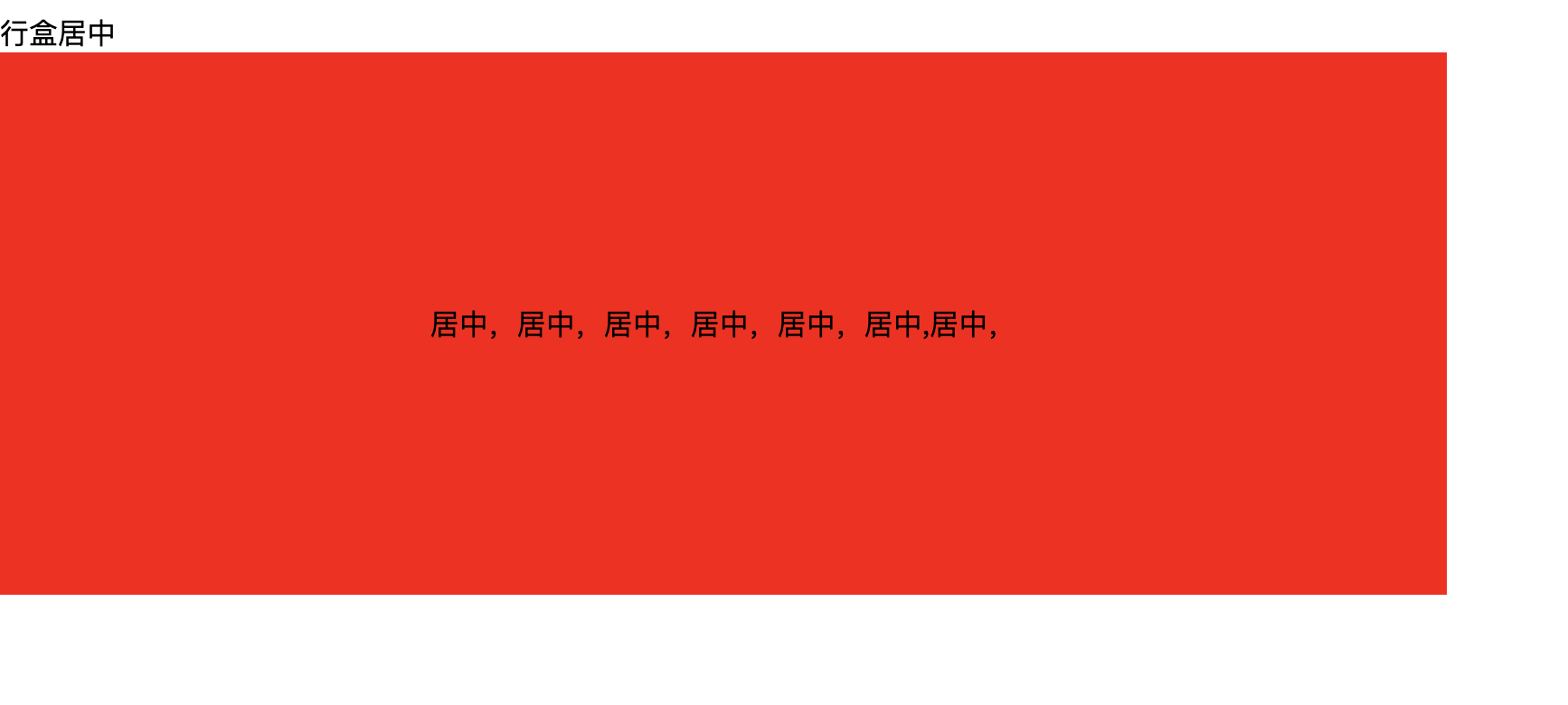
1.line-height + text-aligin:center方式
html
<div class="box">
    <span>
      居中,居中,居中,居中,居中,居中,居中,
    </span>
</div>
css
    .box {
      background: red;
      width: 800px;
      height: 300px;
      /* 垂直居中 */
      line-height: 300px;
      /* 水平居中 */
      text-align: center;
    }
    .box > span {
      display: inline-block;
      /* 需要重新设置line-height,否则会继承父元素的值 */
      line-height: 2em;
    }
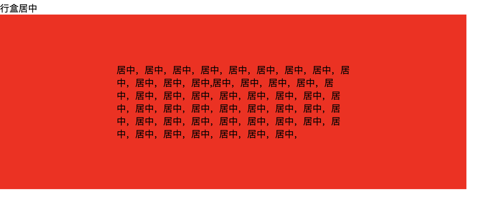
效果:
如果是多行文本呢?
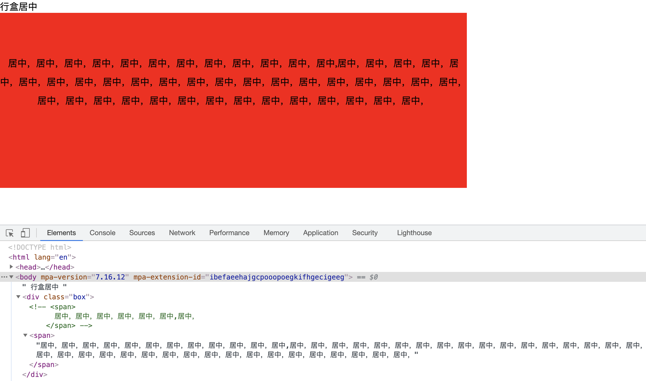
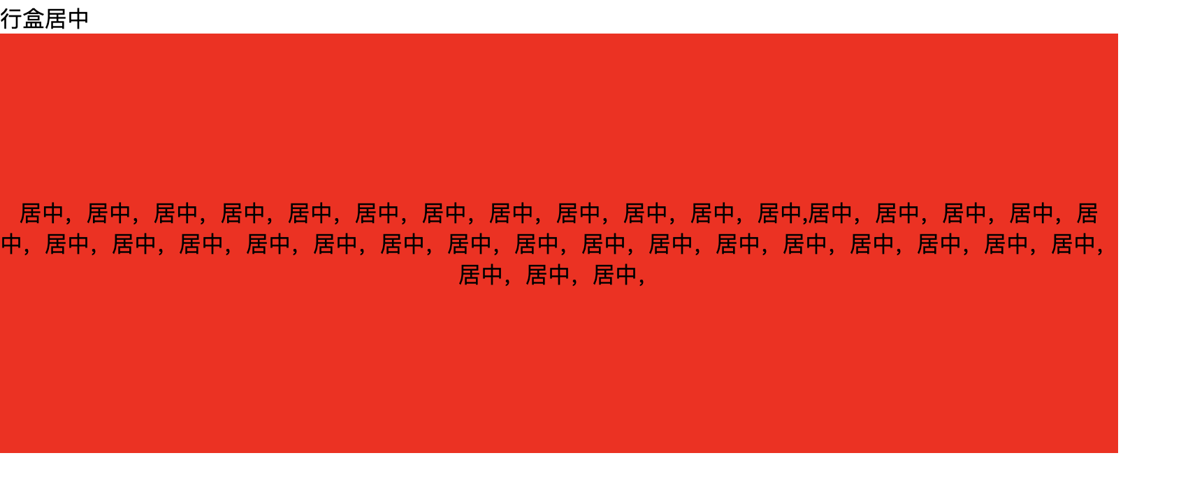
这显然就跟我们预期不符了呀,原因是文本默认是baseline基线对齐的,因此针对多行文本,还需要给子元素span添加vertical-align: middle;
css
    .box > span {
      display: inline-block;
      /* 需要重新设置line-height,否则会继承父元素的值 */
      line-height: 2em;
      /* 设置文本垂直方向对齐方式为居中对齐 */
      vertical-align: middle;
    }
效果
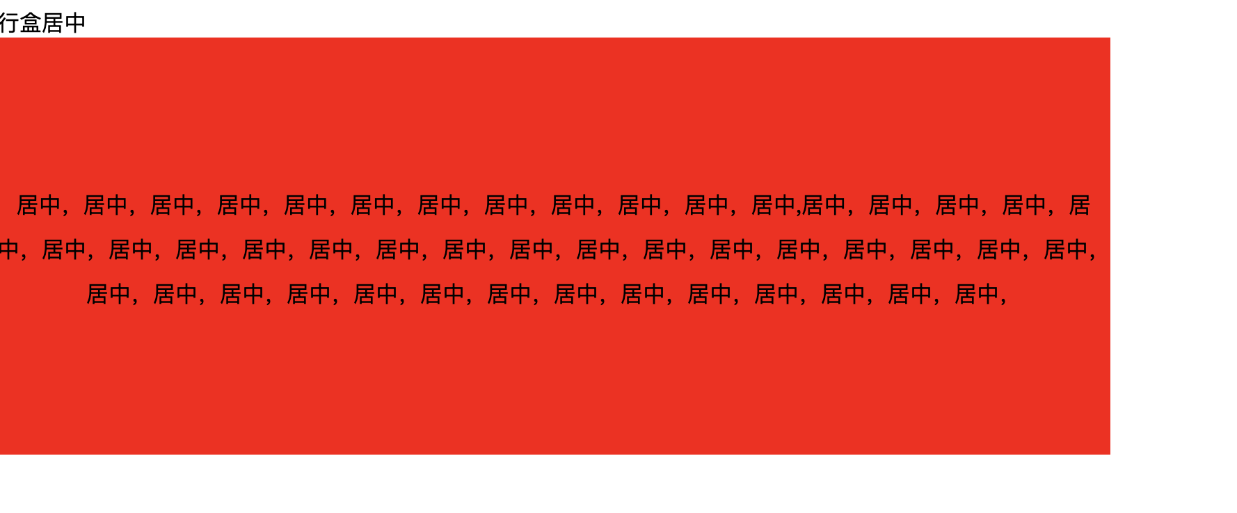
2.padding
这其实是最简单的方式,也是经常容易被忽视的一个方式
html
  <div class="box">
    <span>居中,居中,居中,居中,居中,居中,居中,居中,居中,居中,居中,居中,居中,居中,居中,居中,居中,居中,居中,居中,居中,居中,居中,居中,居中,居中,居中,居中,居中,居中,居中,居中,居中,居中,居中,居中,居中,居中,居中,居中,居中,居中,居中,居中,居中,居中,居中,</span>
  </div>
css
    .box{
      background: red;
      width: 800px;
       /* 上下padding相等 左右padding相等 */
      padding: 100px 50px;
    }
效果
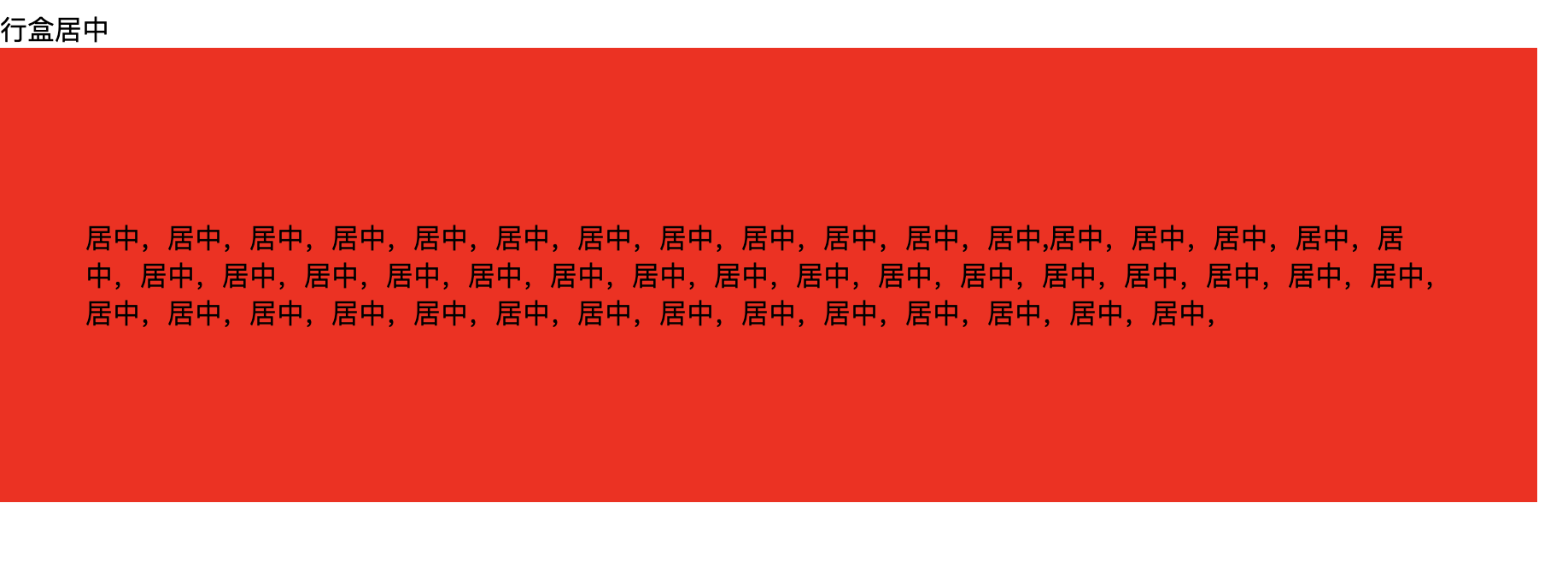
无论是单行文本还是多行文本都适用
3.flex
css
    .box {
      background: red;
      width: 800px;
      height: 300px;
      /* display设为flex */
      display: flex;
      /* 水平居中 */
      justify-content: center;
      /* 垂直居中 */
      align-items: center;
    }
    .box > span {
      margin: 0 50px;
    }
效果

4.父relative+子absolute
css
    .box {
      background: red;
      width: 800px;
      height: 300px;
      position: relative;
    }
    /* 不定宽高、宽高固定都可用 */
    .box > span {
      position: absolute;
      top: 50%;
      left: 50%;
      transform: translate(-50%, -50%);
    }
效果
    .box {
      background: red;
      width: 800px;
      height: 300px;
      position: relative;
    }
    /* 宽高固定 */
    .box > div {
      position: absolute;
      width: 200px;
      height: 200px;
      background: gold;
      top: 50%;
      left: 50%;
      margin-left: -100px;
      margin-top: -100px;
    }
效果

5.table-cell
css
    .box {
      background: red;
      width: 800px;
      height: 300px;
      display: table-cell;
      vertical-align: middle;
      text-align: center;
    }
效果
块元素
块元素的垂直水平居中,以上所述的5种方式其实也都适用,但还有常见的两种方式。
1.父bfc + 子margin:(父高度-子高度)/2 auto
html
  <div class="box6">
    <div>
    </div>
  </div>
css
    .box6 {
      background: red;
      width: 800px;
      height: 300px;
      /* 触发bfc 解决父子margin-top塌陷问题 */
      overflow: hidden;
    }
    .box6 > div {
      width: 200px;
      height: 200px;
      background: gold;
      /* 设置margin居中 */
      margin: 50px auto;
    }
效果

2. absolute + margin: auto
html
  <div class="box7">
    <div>
    </div>
  </div>
css
.box7 {
      background: red;
      width: 800px;
      height: 300px;
      /* 父relative */
      position: relative;
    }
    .box7 > div {
      width: 200px;
      height: 200px;
      background: gold;
      /* 子absolute */
      position: absolute;
      /* 上下左右离父元素都为0 */
      top: 0;
      left: 0;
      right: 0;
      bottom: 0;
      /* 剩余空间都被上下左右的margin吸收 */
      margin: auto;
    }
效果

内容来源于网络如有侵权请私信删除
文章来源: 博客园
- 还没有人评论,欢迎说说您的想法!


 客服
客服


