
延迟属性与帧延迟效果对比:
<!DOCTYPE html>
<html lang="en">
<head>
    <meta charset="UTF-8">
    <title>Document</title>
    <meta name="viewport" content="width=device-width,minimum-scale=1.0,maximum-scale=1.0,user-scalable=no">
    <link rel="stylesheet" href="https://maxcdn.bootstrapcdn.com/font-awesome/4.7.0/css/font-awesome.min.css">
    <script src="https://cdn.staticfile.org/jquery/1.10.0/jquery.js"></script>

    <style>
        *{
            margin:0;
            padding:0;
            box-sizing:border-box;
        }
        body{
            width:100vw;
            height:100vh;
            display:flex;
            justify-content: center;
            align-items: center;
            background-color: #34495e;
        }

        div{
            width:100px;
            height:100px;
            background:#ff893b;

            animation-name:scale;
            animation-duration:1s;
            animation-delay:2s;
            animation-iteration-count:infinite;
        }
        @keyframes scale{
            to{
                transform:scale(3);
            }
        }
    </style>
</head>
<body>
    <div></div>

</body>
</html>

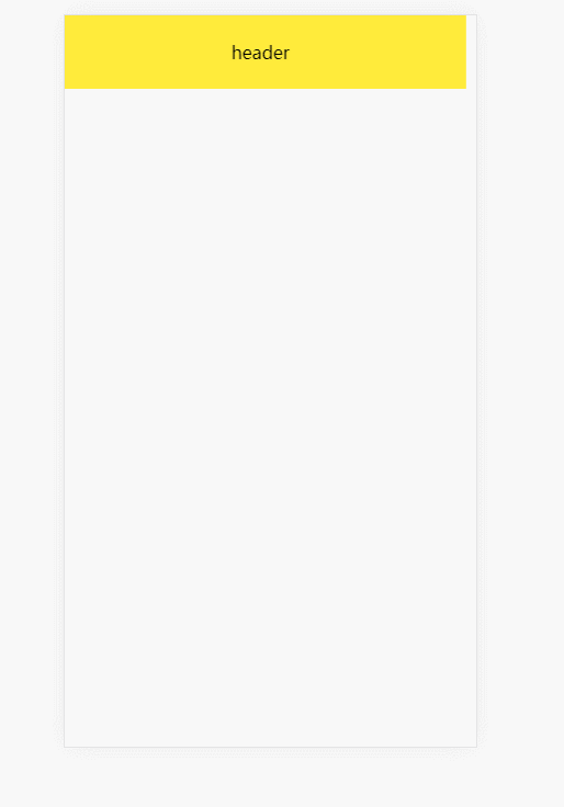
微场景页面布局:
<!DOCTYPE html>
<html lang="en">
<head>
    <meta charset="UTF-8">
    <title>Document</title>
    <meta name="viewport" content="width=device-width,minimum-scale=1.0,maximum-scale=1.0,user-scalable=no">
    <link rel="stylesheet" href="https://maxcdn.bootstrapcdn.com/font-awesome/4.7.0/css/font-awesome.min.css">
    <script src="https://cdn.staticfile.org/jquery/1.10.0/jquery.js"></script>

    <style>
        *{
            margin:0;
            padding:0;
            box-sizing:border-box;
        }
        body{
            width:100vw;
            height:100vh;
            display:grid;
            grid-template-rows:10vh 1fr 10vh;
        }
        header{
            background:#ffeb3b;
            display:flex;
            justify-content:center;
            align-items:center;
            animation-name:translate;
            animation-duration:.5s;
        }
        main{
            background:#abcdef;
            display:flex;
            flex-direction:column;
            justify-content:center;
            align-items:center;
            animation-name:rotate;
            animation-duration:.5s;
            animation-delay:1s;
            animation-fill-mode:backwards;
        }
        div{
            border-radius:10px;
            padding:10px;
            width:80%;
            opacity:.8;
            box-shadow:0 0 10px rgba(0,0,0,.5);
            color:white;

        }
        div:nth-child(1){
            transform:translateY(-50px);
            background:#7b8422;
        }
        div:nth-child(2){
            background:indianred;
        }
        footer{
            background:#878681;
            display:flex;
            justify-content:center;
            align-items:center;
            animation-name:rotate;
            animation-duration:.5s;
            animation-delay:.5s;
            animation-fill-mode:backwards;
        }
        .opacity{
            animation-name:opacity;
            animation-duration:.5s;
            animation-fill-mode:backwards;
        }
        .s1-5{
            animation-delay:1.5s;
        }
        .s2{
            animation-delay:2s;
        }
        @keyframes translate{
            from{
                transform:translateX(-100vw);
            }
            to{
                transform:translateX(0);
            }
        }
        @keyframes rotate{
            from{
                transform:scale(0) rotate(360deg);
            }
            to{
                transform:scale(1) rotate(0deg);
            }
        }
        @keyframes opacity{
            from{
                opacity:0;
            }
            to{
                opacity:1;
            }
        }


    </style>
</head>
<body>
    <header>header</header>
    <main>main
        <div class="opacity s1-5">我们的目标是提供这样一个仓库,让它尽可能全面收录优秀的开源库,并免费为之提供 CDN 加速服务,使之有更好的访问速度和稳定的环境。同时,我们也提供开源库源接入的入口,让所有人都可以提交开源库,包括 JavaScript、CSS、图片和 swf 等静态文件。</div>
        <div class="opacity s2">我们的目标是提供这样一个仓库,让它尽可能全面收录优秀的开源库,并免费为之提供 CDN 加速服务,使之有更好的访问速度和稳定的环境。同时,我们也提供开源库源接入的入口,让所有人都可以提交开源库,包括 JavaScript、CSS、图片和 swf 等静态文件。</div>
    </main>
    <footer>footer</footer>
</body>
</html>
也可以使用动画库:swiper animate.css
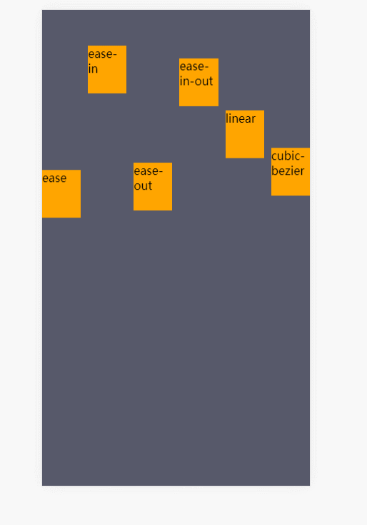
贝塞尔曲线控制动画速率:
<!DOCTYPE html>
<html lang="en">
<head>
    <meta charset="UTF-8">
    <title>Document</title>
    <meta name="viewport" content="width=device-width,minimum-scale=1.0,maximum-scale=1.0,user-scalable=no">
    <link rel="stylesheet" href="https://maxcdn.bootstrapcdn.com/font-awesome/4.7.0/css/font-awesome.min.css">
    <script src="https://cdn.staticfile.org/jquery/1.10.0/jquery.js"></script>

    <style>
        *{
            margin:0;
            padding:0;
            box-sizing:border-box;
        }
        body{
            width:100vw;
            height:100vh;
            background:#57596a;

            display:grid;
            /* 栅格定义一行一列 */
            grid-template:1fr/1fr;

        }
        ul{
            display:grid;
            /* 栅格定义一行五列 */
            grid-template:1fr/repeat(6,1fr);
            list-style:none;
            gap:10px;
        }
        li{
            background:orange;
            height:10vh;

            animation-name:translate;
            animation-duration:2s;
            animation-iteration-count:infinite;
        }
        li:nth-child(1){
            animation-timing-function:ease;
        }
        li:nth-child(2){
            animation-timing-function:ease-in;
        }
        li:nth-child(3){
            animation-timing-function:ease-out;
        }
        li:nth-child(4){
            animation-timing-function:ease-in-out;
        }
        li:nth-child(5){
            animation-timing-function:linear;
        }
        li:nth-child(6){
            animation-timing-function:cubic-bezier(.17,.67,.92,.1);
        }
        @keyframes translate{
            to{
                transform:translateY(90vh);
            }
        }
    </style>
</head>
<body>
    <ul>
        <li>ease</li>
        <li>ease-in</li>
        <li>ease-out</li>
        <li>ease-in-out</li>
        <li>linear</li>
        <li>cubic-bezier</li>
    </ul>
</body>
</html>
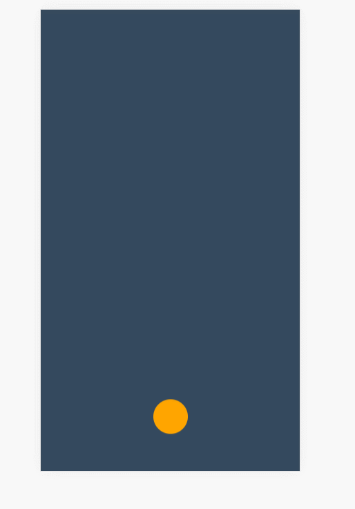
修改关键帧速率制作弹跳球:
<!DOCTYPE html>
<html lang="en">
<head>
    <meta charset="UTF-8">
    <title>Document</title>
    <meta name="viewport" content="width=device-width,minimum-scale=1.0,maximum-scale=1.0,user-scalable=no">
    <link rel="stylesheet" href="https://maxcdn.bootstrapcdn.com/font-awesome/4.7.0/css/font-awesome.min.css">
    <script src="https://cdn.staticfile.org/jquery/1.10.0/jquery.js"></script>

    <style>
        *{
            margin:0;
            padding:0;
            box-sizing:border-box;
        }
        body{
            width:100vw;
            height:100vh;
            background-color: #34495e;
            /* 栅格,一行五列 */
            display:grid;
            grid-template:1fr/repeat(5,1fr);
        }

        div{
            /* 栅格列的定位 */
            grid-column:3/4;
            justify-self:center;

            background:orange;
            height:50px;
            width:50px;
            border-radius:50%;

            animation-name:move;
            animation-duration:4s;
            animation-iteration-count:infinite;
            animation-fill-mode:forwards;
        }
        @keyframes move{
            /* 向上弹的帧 */
            0%{
                transform:translateY(0vh);
            }
            30%{
                transform:translateY(10vh);
            }
            60%{
                transform:translateY(40vh);
            }
            80%{
                transform:translateY(60vh);
            }
            95%{
                transform:translateY(75vh);
            }
            0%,30%,60%,80%,95%{
                animation-timing-function:ease-in;
            }
            /* 向下落的帧 */
            15%,45%,75%,85%,100%{
                transform:translateY(90vh);
                animation-timing-function:ease-out;
            }
        }
    </style>
</head>
<body>
    <div></div>
</body>
</html>
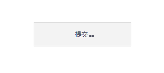
盒阴影偏移技巧与currentColor特性:
currentColor 指当前定义的color的颜色
提交按钮加载动画效果:
<!DOCTYPE html>
<html lang="en">
<head>
    <meta charset="UTF-8">
    <title>Document</title>
    <meta name="viewport" content="width=device-width,minimum-scale=1.0,maximum-scale=1.0,user-scalable=no">
    <link rel="stylesheet" href="https://maxcdn.bootstrapcdn.com/font-awesome/4.7.0/css/font-awesome.min.css">
    <script src="https://cdn.staticfile.org/jquery/1.10.0/jquery.js"></script>

    <style>
        *{
            margin:0;
            padding:0;
            box-sizing:border-box;
        }
        body{
            width:100vw;
            height:100vh;
            display:grid;
            grid-template:1fr/1fr;
        }

        button{
            align-self:center;
            justify-self:center;

            background:#f3f3f3;
            height:50px;
            width:200px;

            color:#4e505f;
            border:1px solid #ddd;
        }
        button::after{
            content:'';
            width:3px;
            height:3px;
            display:inline-block; /*块元素才能加阴影*/
            box-shadow:3px 0 0 currentColor,9px 0 0 currentColor,15px 0 0 currentColor;

            animation-name:hd;
            animation-duration:1s;
            animation-iteration-count:infinite;
        }
        @keyframes hd{
            from{
                box-shadow:none;
            }
            30%{
                box-shadow:3px 0 0 currentColor;
            }
            60%{
                box-shadow:3px 0 0 currentColor,9px 0 0 currentColor;
            }
            90%{
                box-shadow:3px 0 0 currentColor,9px 0 0 currentColor,15px 0 0 currentColor;
            }
        }
    </style>
</head>
<body>
    <button>提交</button>
</body>
</html>
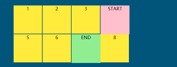
steps步进动画规则详解:
<!DOCTYPE html>
<html lang="en">
<head>
    <meta charset="UTF-8">
    <title>Document</title>
    <link rel="stylesheet" href="https://maxcdn.bootstrapcdn.com/font-awesome/4.7.0/css/font-awesome.min.css">

    <style>
        *{
            margin:0;
            padding:0;
            box-sizing:border-box;
            list-style:none;
        }
        body{
            width:100vw;
            height:100vh;
            display:grid;
            background:#01547a;
        }
        main{
            width:400px;
            height:200px;
            background:red;
            justify-self:center;
            align-self:center;
            display:grid;
            grid-template:repeat(2,1fr)/repeat(4,1fr);
        }
        div{
            text-align:center;
            background:#ffeb3b;
            border:1px solid #01547a;
            box-sizing:border-box;
            position:relative;
        }
        div:nth-child(1)::before{
            content:'START';
            width:100px;
            height:100px;
            background:pink;
            position:absolute;
            top:0;
            left:0;

            animation-timing-function:steps(4,start);
        }
        div:nth-child(5)::before{
            content:'END';
            width:100px;
            height:100px;
            background:lightgreen;
            position:absolute;
            top:0;
            left:0;

            animation-timing-function:steps(4,end);
        }
        div:nth-child(1)::before,
        div:nth-child(5)::before{
            animation-name:hd;
            animation-duration:2s;
            animation-iteration-count:infinite;
            z-index:2;
        }
        @keyframes hd{
            to{
                transform:translateX(400px);
            }
        }


    </style>
</head>
<body>
    <main>
        <div>1</div>
        <div>2</div>
        <div>3</div>
        <div>4</div>
        <div>5</div>
        <div>6</div>
        <div>7</div>
        <div>8</div>
    </main>
</body>
</html>
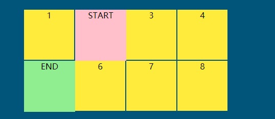
step-start与step-end单步处理:
<!DOCTYPE html>
<html lang="en">
<head>
    <meta charset="UTF-8">
    <title>Document</title>
    <link rel="stylesheet" href="https://maxcdn.bootstrapcdn.com/font-awesome/4.7.0/css/font-awesome.min.css">

    <style>
        *{
            margin:0;
            padding:0;
            box-sizing:border-box;
            list-style:none;
        }
        body{
            width:100vw;
            height:100vh;
            display:grid;
            background:#01547a;
        }
        main{
            width:400px;
            height:200px;
            background:red;
            justify-self:center;
            align-self:center;
            display:grid;
            grid-template:repeat(2,1fr)/repeat(4,1fr);
        }
        div{
            text-align:center;
            background:#ffeb3b;
            border:1px solid #01547a;
            box-sizing:border-box;
            position:relative;
        }
        div:nth-child(1)::before{
            content:'START';
            width:100px;
            height:100px;
            background:pink;
            position:absolute;
            top:0;
            left:0;

            animation-timing-function:steps(1,start);
            animation-timing-function:step-start;
        }
        div:nth-child(5)::before{
            content:'END';
            width:100px;
            height:100px;
            background:lightgreen;
            position:absolute;
            top:0;
            left:0;

            animation-timing-function:steps(1,end);
            animation-timing-function:step-end;
        }
        div:nth-child(1)::before,
        div:nth-child(5)::before{
            animation-name:hd;
            animation-duration:2s;
            animation-iteration-count:infinite;
            z-index:2;
        }
        @keyframes hd{
            50%{
                transform:translateX(100px);
            }
            to{
                transform:translateX(0);
            }
        }


    </style>
</head>
<body>
    <main>
        <div>1</div>
        <div>2</div>
        <div>3</div>
        <div>4</div>
        <div>5</div>
        <div>6</div>
        <div>7</div>
        <div>8</div>
    </main>
</body>
</html>
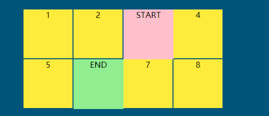
animation-play-state 控制动画播放与暂停:
<!DOCTYPE html>
<html lang="en">
<head>
    <meta charset="UTF-8">
    <title>Document</title>
    <link rel="stylesheet" href="https://maxcdn.bootstrapcdn.com/font-awesome/4.7.0/css/font-awesome.min.css">

    <style>
        *{
            margin:0;
            padding:0;
            box-sizing:border-box;
            list-style:none;
        }
        body{
            width:100vw;
            height:100vh;
            display:grid;
            background:#01547a;
        }
        main{
            width:400px;
            height:200px;
            background:red;
            justify-self:center;
            align-self:center;
            display:grid;
            grid-template:repeat(2,1fr)/repeat(4,1fr);
        }
        div{
            text-align:center;
            background:#ffeb3b;
            border:1px solid #01547a;
            box-sizing:border-box;
            position:relative;
        }
        div:nth-child(1)::before{
            content:'START';
            width:100px;
            height:100px;
            background:pink;
            position:absolute;
            top:0;
            left:0;

            animation-timing-function:steps(4,start);
        }
        div:nth-child(5)::before{
            content:'END';
            width:100px;
            height:100px;
            background:lightgreen;
            position:absolute;
            top:0;
            left:0;

            animation-timing-function:steps(4,end);
        }
        div:nth-child(1)::before,
        div:nth-child(5)::before{
            animation-name:hd;
            animation-duration:2s;
            animation-iteration-count:infinite;
            z-index:2;

            animation-play-state:paused;
        }
        main:hover div::before{
            animation-play-state:running;
        }
        @keyframes hd{
            to{
                transform:translateX(400px);
            }
        }


    </style>
</head>
<body>
    <main>
        <div>1</div>
        <div>2</div>
        <div>3</div>
        <div>4</div>
        <div>5</div>
        <div>6</div>
        <div>7</div>
        <div>8</div>
    </main>
</body>
</html>
纯css3的网站轮换图:
<!DOCTYPE html>
<html lang="en">
<head>
    <meta charset="UTF-8">
    <title>Document</title>
    <link rel="stylesheet" href="https://maxcdn.bootstrapcdn.com/font-awesome/4.7.0/css/font-awesome.min.css">

    <style>
        *{
            margin:0;
            padding:0;
            box-sizing:border-box;
            list-style:none;
        }
        body{
            width:100vw;
            height:100vh;
            display:grid;
            background:#01547a;
        }
        main{
            width:400px;
            height:200px;
            justify-self:center;
            align-self:center;
            overflow:hidden;
            position:relative;
        }
        section{
            width:1600px;
            height:200px;
            display:grid;
            grid-template:1fr/repeat(4,400px);
            animation-name:slide;
            animation-duration:4s;
            animation-timing-function:steps(4,end);
            animation-iteration-count:infinite;
        }
        section:hover,
        section:hover+ul::after{
            /* 鼠标移入时轮播图暂停 */
            animation-play-state:paused;
        }
        div{
            overflow:hidden;
        }
        img{
            width:100%;
        }
        @keyframes slide{
            to{
                transform:translateX(-1600px);
            }
        }
        @keyframes num{
            to{
                transform:translateX(200px);
            }
        }
        ul{
            position:absolute;
            left:50%;
            bottom:20px;
            transform:translateX(-50%);
            display:grid;
            grid-template:1fr/repeat(4,1fr);
            list-style:none;
            width:200px;
            justify-items:center;
        }
        ul::after{
            content:'';
            position:absolute;
            left:10px;
            background:#f44336;
            top:0;
            width:30px;
            height:30px;
            border-radius:50%;
            z-index:-1;

            animation-name:num;
            animation-duration:4s;
            animation-timing-function:steps(4,end);
            animation-iteration-count:infinite;
        }
        li{
            width:30px;
            height:30px;
            border-radius:50%;
            background:rgba(0,0,0,.5);
            display:grid;
            justify-items:center;
            align-items:center;
            color:white;
        }

    </style>
</head>
<body>
    <main>
        <section>
            <div><img src="https://timgsa.baidu.com/timg?image&quality=80&size=b9999_10000&sec=1605196795432&di=c5722991665c7cbecde51004044a3480&imgtype=0&src=http%3A%2F%2Fc-ssl.duitang.com%2Fuploads%2Fitem%2F202006%2F15%2F20200615144517_nXCSe.thumb.400_0.jpeg" alt=""></div>
            <div><img src="https://ss1.bdstatic.com/70cFvXSh_Q1YnxGkpoWK1HF6hhy/it/u=1352056604,3886928601&fm=26&gp=0.jpg" alt=""></div>
            <div><img src="https://timgsa.baidu.com/timg?image&quality=80&size=b9999_10000&sec=1605196816727&di=0fe20015abb70cebcb629469edb2ce00&imgtype=0&src=http%3A%2F%2Fc-ssl.duitang.com%2Fuploads%2Fitem%2F202002%2F11%2F20200211120916_SXQzf.thumb.400_0.jpeg" alt=""></div>
            <div><img src="https://timgsa.baidu.com/timg?image&quality=80&size=b9999_10000&sec=1605196847395&di=484b7f335e5359c649c7ce0c815e95d5&imgtype=0&src=http%3A%2F%2Fc-ssl.duitang.com%2Fuploads%2Fitem%2F202002%2F27%2F20200227181512_vtype.thumb.400_0.jpeg" alt=""></div>
        </section>
        <ul>
            <li>1</li>
            <li>2</li>
            <li>3</li>
            <li>4</li>
        </ul>
    </main>
</body>
</html>

animation-fill-mode 动画填充模式:
<!DOCTYPE html>
<html lang="en">
<head>
    <meta charset="UTF-8">
    <title>Document</title>
    <link rel="stylesheet" href="https://maxcdn.bootstrapcdn.com/font-awesome/4.7.0/css/font-awesome.min.css">

    <style>
        *{
            margin:0;
            padding:0;
            box-sizing:border-box;
            list-style:none;
        }
        body{
            width:100vw;
            height:100vh;
            display:grid;
            background:#01547a;
        }
        ul{
            list-style:none;
            width:400px;
            height:100px;
            justify-self:center;
            align-self:center;
            display:grid;
            grid-template:1fr/repeat(4,1fr);
        }
        li{
            width:100px;
            height:100px;
            background:orange;
            border-radius:50%;
            display:grid;
            justify-items:center;
            align-items:center;

            animation-name:hd;
            animation-duration:2s;
            animation-delay:2s;
        }
        li:nth-child(1){
            /* 延迟过程中使用元素默认的效果,结束之后回到默认的效果 */
            animation-fill-mode:normal;
        }
        li:nth-child(2){
            /* 延迟过程中使用起始帧的效果,结束之后回到默认的效果 */
            animation-fill-mode:backwards;
        }
        li:nth-child(3){
             /* 延迟过程中使用元素默认的效果,结束之后回到结束帧 */
            animation-fill-mode:forwards;
        }
        li:nth-child(4){
            /* 延迟过程中使用起始帧的效果,结束之后回到结束帧 */
            animation-fill-mode:both;
        }
        @keyframes hd{
            from{
                transform:scale(0);
            }
            to{
                transform:scale(1);
                background:lightblue;
            }
        }
    </style>
</head>
<body>
    <ul>
        <li>normal</li>
        <li>backwards</li>
        <li>forwards</li>
        <li>both</li>
    </ul>
</body>
</html>
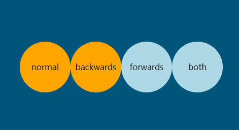
animation动画组合定义语法:
<!DOCTYPE html>
<html lang="en">
<head>
    <meta charset="UTF-8">
    <title>Document</title>
    <link rel="stylesheet" href="https://maxcdn.bootstrapcdn.com/font-awesome/4.7.0/css/font-awesome.min.css">

    <style>
        *{
            margin:0;
            padding:0;
            box-sizing:border-box;
            list-style:none;
        }
        body{
            width:100vw;
            height:100vh;
            display:grid;
            background:#01547a;
        }
        ul{
            list-style:none;
            width:400px;
            height:100px;
            justify-self:center;
            align-self:center;
            display:grid;
            grid-template:1fr/repeat(4,1fr);
        }
        li{
            width:100px;
            height:100px;
            background:orange;
            border-radius:50%;
            display:grid;
            justify-items:center;
            align-items:center;
        }
        li:nth-child(1){
            /* 延迟过程中使用元素默认的效果,结束之后回到默认的效果 */
            animation:hd normal 2s 2s;
        }
        li:nth-child(2){
            /* 延迟过程中使用起始帧的效果,结束之后回到默认的效果 */
            animation:hd backwards 2s 2s;
        }
        li:nth-child(3){
             /* 延迟过程中使用元素默认的效果,结束之后回到结束帧 */
             animation:hd forwards 2s 2s;
        }
        li:nth-child(4){
            /* 延迟过程中使用起始帧的效果,结束之后回到结束帧 */
            animation:hd both 2s 2s;
        }
        @keyframes hd{
            from{
                transform:scale(0);
            }
            to{
                transform:scale(1);
                background:lightblue;
            }
        }
    </style>
</head>
<body>
    <ul>
        <li>normal</li>
        <li>backwards</li>
        <li>forwards</li>
        <li>both</li>
    </ul>
</body>
</html>
内容来源于网络如有侵权请私信删除
文章来源: 博客园
- 还没有人评论,欢迎说说您的想法!


 客服
客服


