
vue对组件进行二次封装
经常遇到常用组件与设计图有微小区别的情况,但是自写组件功能又太单一(划掉 其实原因就是懒),这个时候对组件封装就很有用处
例如对 element 的 MessageBox 二次封装
组件有很多自定义内容
例如 MessageBox 可自定义配置不同内容。
<template>
  <el-button type="text" @click="open">点击打开 Message Box</el-button>
</template>

<script>
  export default {
    methods: {
      open() {
        const h = this.$createElement;
        this.$msgbox({
          title: '消息',
          message: h('p', null, [
            h('span', null, '内容可以是 '),
            h('i', { style: 'color: teal' }, 'VNode')
          ]),
          showCancelButton: true,
          confirmButtonText: '确定',
          cancelButtonText: '取消',
          beforeClose: (action, instance, done) => {
            if (action === 'confirm') {
              instance.confirmButtonLoading = true;
              instance.confirmButtonText = '执行中...';
              setTimeout(() => {
                done();
                setTimeout(() => {
                  instance.confirmButtonLoading = false;
                }, 300);
              }, 3000);
            } else {
              done();
            }
          }
        }).then(action => {
          this.$message({
            type: 'info',
            message: 'action: ' + action
          });
        });
      }
    }
  }
</script>
那么就可以根据组件的自定义内容去封装一个符合设计需求的组件
代码结构
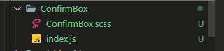
index.js
import { MessageBox } from 'element-ui'
import './ConfirmBox.scss'

export default function(
  title = '提示',
  message = '提示内容',
  icon = 'warning'
) {
  const h = this.$createElement
  return MessageBox({
    message: h('div', null, [
      h(
        'div',
        {
          class: {
            'confirm-box-header': true
          }
        },
        [
          h('svg-icon', {
            props: {
              'icon-class': icon,
              'class-name': 'confirm-box-icon'
            }
          }),
          h(
            'span',
            {
              class: {
                'confirm-box-title': true
              }
            },
            title
          )
        ]
      ),
      h(
        'div',
        {
          class: {
            'confirm-box-message': true
          }
        },
        message
      )
    ]),
    customClass: 'confirm-box',
    showCancelButton: true,
    confirmButtonText: '确定',
    cancelButtonText: '取消'
  })
}
ConfirmBox.scss
.confirm-box {
  padding-bottom: 24px;

  .el-message-box__content {
    padding: 36px 24px;

    .confirm-box-header {
      display: flex;
      flex-direction: row;
      justify-content: flex-start;
      align-items: center;
    }

    .confirm-box-icon {
      width: 16px;
      height: 16px;
    }

    .confirm-box-title {
      display: block;
      padding-left: 12px;
      font-size: 16px;
      font-weight: 500;
      color: $primary-font;
      line-height: 24px;
    }

    .confirm-box-message {
      padding: 12px 0 0 28px;

      font-size: 14px;
      font-weight: 400;
      color: $primary-font;
      line-height: 22px;
    }
  }
}
使用方式
main.js 加以下两行
import ConfirmBox from '@/components/ConfirmBox'
Vue.prototype.$confirmBox = ConfirmBox
使用效果 看起来好像像那么回事(虽然不是自写组件,但是写起来快啊)
      this.$confirmBox(
        '我大标题',
        '我是内容'
      )
        .then(async () => {
        })
        .catch(() => {})
内容来源于网络如有侵权请私信删除
文章来源: 博客园
- 还没有人评论,欢迎说说您的想法!


 客服
客服


