
基于vue.js构建的轻量级Vue移动端弹出框组件Vpopup
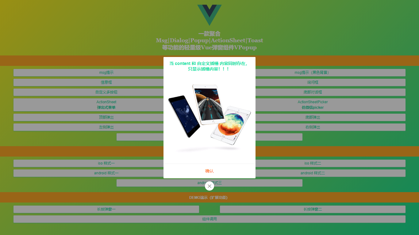
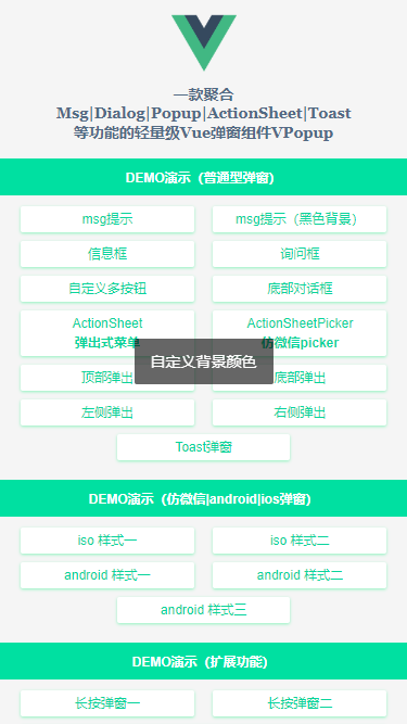
vpopup 汇聚了有赞Vant、京东NutUI等Vue组件库的Msg消息框、Popup弹层、Dialog对话框、Toast弱提示、ActionSheet动作面板框、Notify通知框等功能。
用法
▍在main.js中引入vpopup组件
import Popup from './components/popup'
Vue.use(Popup)
vpopup支持标签式及函数式调用方式。
- 标签式
<template>
    <view class="demo">
        ...

        <!-- 弹窗模板 -->
        <v-popup
            v-model="showDialog"
            type="ios"
            anim="fadeIn"
            title="标题"
            content="弹窗内容信息,弹窗内容信息!"
            shadeClose="false"
            xclose
            :btns="[
                {...},
                {...},
            ]"
        />
    </view>
</template>
- 函数式
通过 this.$vpopup({...options}) 方式调用即可,函数会返回弹窗实例。
<script>
    export default {
        ...
        methods: {
            handleShowPopup() {
                let $el = this.$vpopup({
                    type: 'ios',
                    title: '标题',
                    content: '弹窗内容信息,弹窗内容信息!',
                    anim: 'scaleIn',
                    shadeClose: false,
                    xclose: true,
                    onOpen: () => {
                        console.log('vpopup is opened!')
                    },
                    btns: [
                        {text: '取消'},
                        {
                            text: '确定',
                            style: 'color:#00e0a1',
                            click: () => {
                                $el.close()
                            }
                        }
                    ]
                });
            }
        }
    }
</script>
大家可以根据项目实际需要,自行选择调用方式。
- msg消息提示
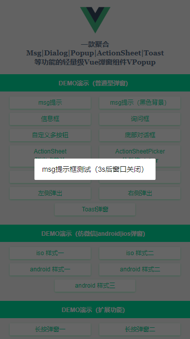
<!-- msg提示 -->
<v-popup v-model="showMsg" anim="fadeIn" content="msg提示框测试(3s后窗口关闭)" shadeClose="false" time="3" />

<!-- msg提示(自定义背景) -->
<v-popup v-model="showMsgBg" anim="footer" content="自定义背景颜色" shade="false" time="2"
    popup-style="background:rgba(0,0,0,.6);color:#fff;"
/>
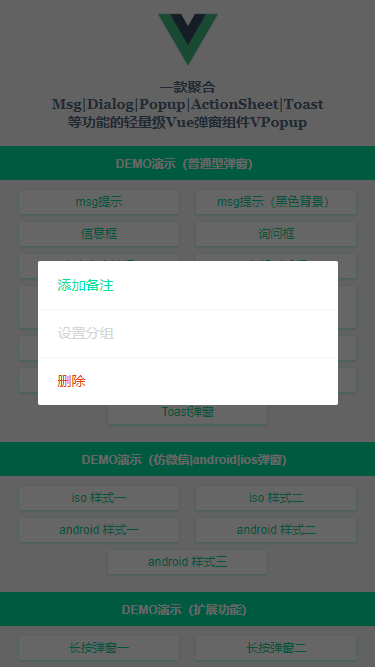
- actionsheet及footer动作面板框
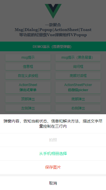
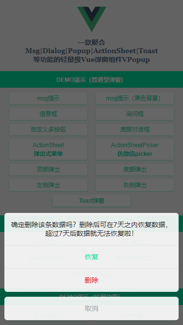
<!-- ActionSheet底部弹出式菜单 -->
<v-popup v-model="showActionSheet" anim="footer" type="actionsheet" :z-index="2020"
    content="弹窗内容,告知当前状态、信息和解决方法,描述文字尽量控制在三行内"
    :btns="[
        {text: '拍照', style: 'color:#09f;', disabled: true, click: handleInfo},
        {text: '从手机相册选择', style: 'color:#00e0a1;', click: handleInfo},
        {text: '保存图片', style: 'color:#e63d23;', click: () => null},
        {text: '取消', click: () => showActionSheet=false},
    ]"
/>

<!-- 底部对话框 -->
<v-popup v-model="showFooter" anim="footer" type="footer" :shadeClose="false" z-index="8080"
    content="确定删除该条数据吗?删除后可在7天之内恢复数据,超过7天后数据就无法恢复啦!"
    :btns="[
        {text: '恢复', style: 'color:#00e0a1;', click: handleInfo},
        {text: '删除', style: 'color:#ee0a24;', click: () => null},
        {text: '取消', style: 'color:#a9a9a9;', click: () => showFooter=false},
    ]"
/>
- Toast弱提示框(loading | success | info三种svg图标)
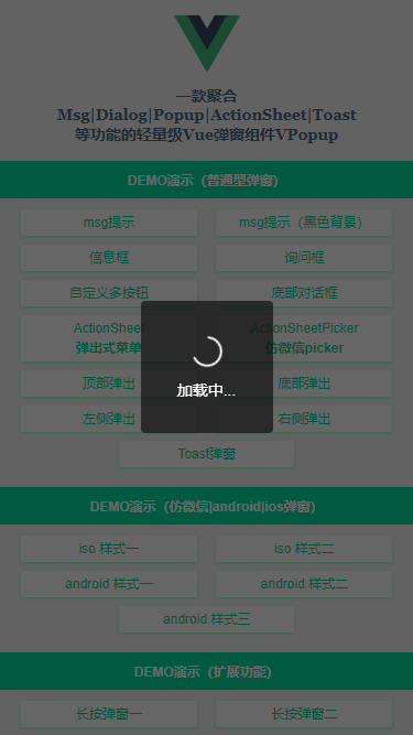
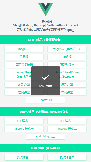
<!-- Toast弹窗 -->
<v-popup v-model="showToast" type="toast" icon="loading" time="5" content="加载中..." />
<v-popup v-model="showToast" type="toast" icon="success" shade="false" time="3" content="成功提示" />
<v-popup v-model="showToast" type="toast" icon="fail" shade="false" time="3" content="失败提示" />
- android/微信弹窗效果
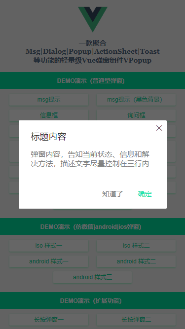
<!-- Android样式1 -->
<v-popup v-model="showAndroid1" type="android" shadeClose="false" xclose title="标题内容" z-index="2001"
    content="弹窗内容,告知当前状态、信息和解决方法,描述文字尽量控制在三行内"
    :btns="[
        {text: '知道了', click: () => showAndroid1=false},
        {text: '确定', style: 'color:#00e0a1;', click: handleInfo},
    ]"
>
</v-popup>
so nice,看到了这里,是不是感觉还行!这可是牺牲了一点国庆假期倒腾出来的
文章来源: 博客园内容来源于网络如有侵权请私信删除


 客服
客服


